
If you wish to see all the technical details I’ve published a paper with the link below:

So I know the question will come up at some stage so I thought I would just skip to the spoiler. Why? Well because one night about four months ago I was busy defragging by brain while trying to go to sleep and though to myself, “Is it possible to predict where a business should build their branches based on satellite data alone?” So let me Let me regale you with the story of how I set about to find the answer. I decided to focus on Cape Town specific as I might be a bit bias. And it was very nice to lean something new about a place I call home.
The famous quote by Carl Sagan says, “If you wish to make an apple pie from scratch, you must first invent the universe.” And that is almost what I had to do, figuratively speaking of course. I had to start from scratch and build every step one at a time. Sure I checked to see if there where some applications that I could just plug my request in and as of the start of the project there where none, however google released Planetary Prediction Engine on the 27’th of August that can now be to do all of what I slaved over for months in a couple of minutes. Much faster yes, but then I would not have learnt all I had doing it all “by hand”.
My main steps in this process where:
- Finding useful data
- Mapping historical growth over time
- Predicting future growth
- Predicting where to place new branches and ATM’s
Data sources
To invent the universe in order to bake your apple pie you need ingredients and in this case a ton of satellite satellite images. Normally I would have needed to take the raw images and convert them into numerical data by training a custom model to recognize buildings, roads, mountains and so on. As fun as that sounds, and I’m actually not being sarcastic, it would have taken me many times longer to finish this project. Luckily for me, people much smarter than I did most of the hard word and all I had to do was to mix the ingredients.
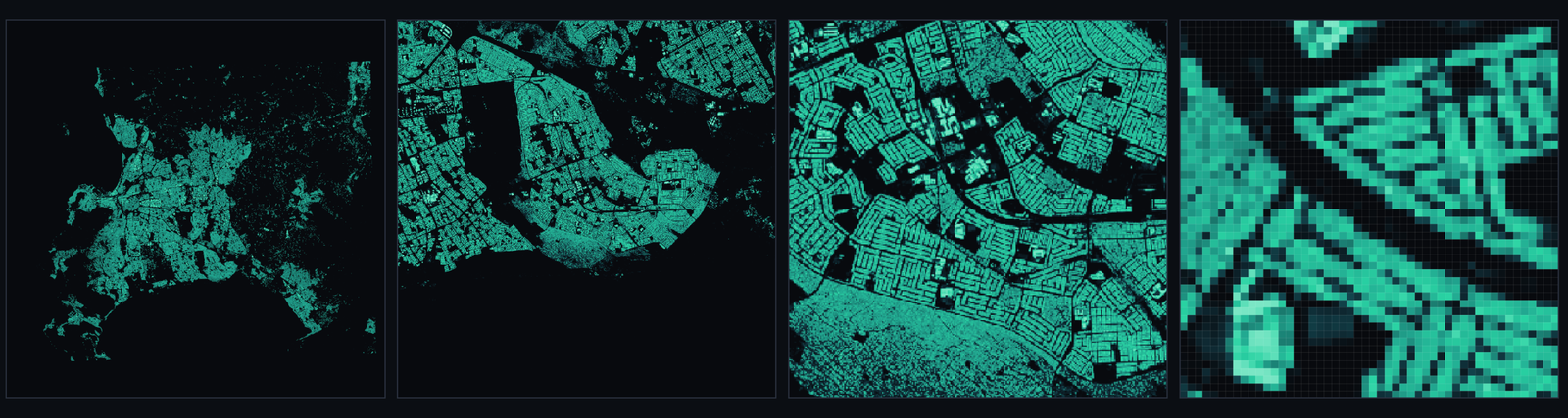
In total this project used about 22GB of data made up of 114404 files and 11690 folders. That is a lot of ingredients just to give you an idea. Most of the time I worked with raw data and only used the images as reference to make sure I was still on the right track. Below is an example of the kind of data I was working with. In this case each line represented a 10×10 meter area and all the other columns described the properties of that section of land. Most was in CSV format but there was some XML, JSON and TIFF (not the image format) in there as well.

However looking at numbers can get boring so below is a short video where I combined all the visual representations of the data. All in all I downloaded 29 datasets but ended only using about ten percent of them as they best suited my needs for this project. Not only did I download multiple number of datasets I also downloaded a wide data range of each one of one. Some going back to 1970’s. The video shows a small time laps of each.
Below is a list of all the maps I managed to obtain that you can see in the video below:
- Buildings & Paved Areas Map: shows where buildings and paved surfaces are versus natural land
- Bare Soil Map: shows how likely each spot is to be bare dirt with nothing growing on it
- Built-Up Areas Map: shows how likely each spot is to be a building, road, or other man-made surface
- Water Likelihood Map: shows how likely each spot is to be water
- Enhanced City View: a color-boosted satellite photo that makes city buildings easier to spot
- Enhanced Greenery View: a color-boosted satellite photo that makes plants and greenery stand out
- All-Weather Radar Image (rough surfaces): a radar picture that works day or night and through cloud; good at picking out rough things like plants and buildings
- All-Weather Radar Image (smooth surfaces): a radar picture that works day or night and through cloud; good at picking out smooth things like water and flat ground
- Regular Satellite Photo: a normal-looking satellite photo, like what you’d see from a plane
- Plant Health Map: shows how healthy and thick the greenery is in each area
- Hidden Water Map: highlights water that’s hard to see in a normal photo, even if it’s shallow
- Night Lights Map: shows how much artificial light shines at night; a rough sign of how busy or developed an area is
- Building Density Map: estimates how many buildings are packed into each area
- Building Confidence Map: shows how sure the data is that a building actually exists at that spot
- Official Building Outlines: the city’s own map of buildings, traced from rooftops
- Special Plant-Health Photo: a special type of photo that’s great for showing plant health and land use
- Population Map: shows roughly how many people live in each area
- Non-Home Buildings Map: shows how much land is covered by buildings that aren’t homes, like offices, shops and factories
- All Buildings Map: shows how much land is covered by any kind of building at all
- City vs Town vs Rural Map: classifies each area as city, town or rural based on how built-up and populated it is
- Height Above Sea Level Map: shows how high the ground is at each point
- Worst-Case Flood Depth Map: shows how deep water would likely get in a very severe, rare flood
- Flood Risk Map: shows how high each spot sits above the nearest stream; a clue to flood risk
- River Width Map: shows how wide the rivers are at each point
- Steepness Map: shows how steep the ground is at each spot
- Slope Direction Map: shows which way each slope faces, like north or south
- 3D Shaded Terrain Map: a shaded picture that makes hills and valleys easier to see
- Water Catchment Map: shows how much land drains into that point; bigger numbers mean more water could flow through there
- How Often It’s Wet Map: shows how often that spot has been covered by water over time
Please note for some reason embedded videos tend to play at a very low quality so you might need to manually change the resolution to 1080p or higher to see all the details.
So where did I get all this amazing data? Most of the satellite data came through Google Earth Engine. The main satellite archive covered 2015 to mid-2026, using Copernicus Sentinel-1 and Sentinel-2, with Landsat 7, 8 and 9 as additional sources. Key comparison images were taken from 2016, 2023 and 2025. For the long-term history of Cape Town’s expansion, I used the JRC Global Human Settlement Layer from 1975 to 2020. Its latest underlying satellite observation is from 2018. I then used Google Open Buildings, which provides annual building information from 2016 to 2023, to create a combined urban-growth timeline running from 1975 to 2023. GHSL and Open Buildings Temporal The City of Cape Town’s aerial imagery and roof records covered December 2013 to January 2025. Mountain and elevation data came from the static Copernicus DEM GLO-30 dataset. Historical surface-water information came from JRC Global Surface Water, covering 1984 to 2021. Flood depth came from the JRC CEMS GLOFAS flood-hazard scenarios, and river networks and drainage came from MERIT Hydro. The terrain, flood and river layers are physical reference layers rather than yearly time series. JRC Global Surface Water Land-cover information came from Dynamic World, with 2023 used as the main reference year. Population information came from WorldPop, with the project using the 2020 estimate. Night-time lighting came from NOAA VIIRS, comparing 2016 with 2023. Climate information came from monthly ECMWF ERA5-Land data covering the project period from 2015 to mid-2026. Finally, roads and other geographic features came from an OpenStreetMap snapshot dated July 2026, downloaded through Geofabrik and supplemented with the Overpass API.
Mapping growth over time
Well now that I have all the juicy data, where shall we start? Well lets see how the city and surrounding areas have grown in the past to see if we can get some insights from that. I found two main datasets one from 1975-2023 and one from 2016 to 2023. I did find other data that had up to date data, however there where not enough overlap and historical data to make any good use of it. So I ended up mostly only using the data from 2016-2023 as this dataset had the most “bang for my buck” as they say. I did however decide to map the expansion for 1975-2023 along with a combination of the dataset for 2016-2023 just to see how Cape Town grew from back in the day to modern times.
1975-2023
Below is an historical account of how Cape Town expanded from 1975 on wards. This is rather impressive as back in the day all of this had to be done by hand, no satellites, computer or even cellphones to help you out. Just pen, paper and that gray stuff we all now swapped for AI.
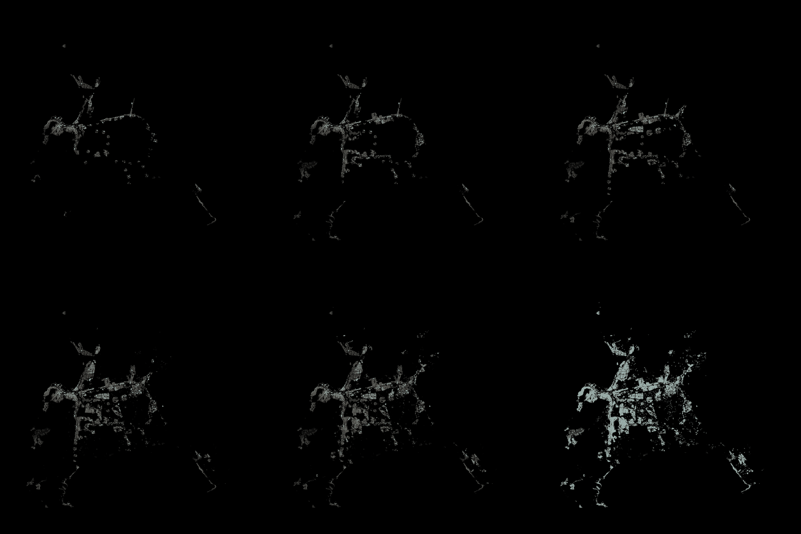
Here are the same data but only shown in different ways. Below shows the grown as “air streams” that indicates the direction and intensity of the city growth.
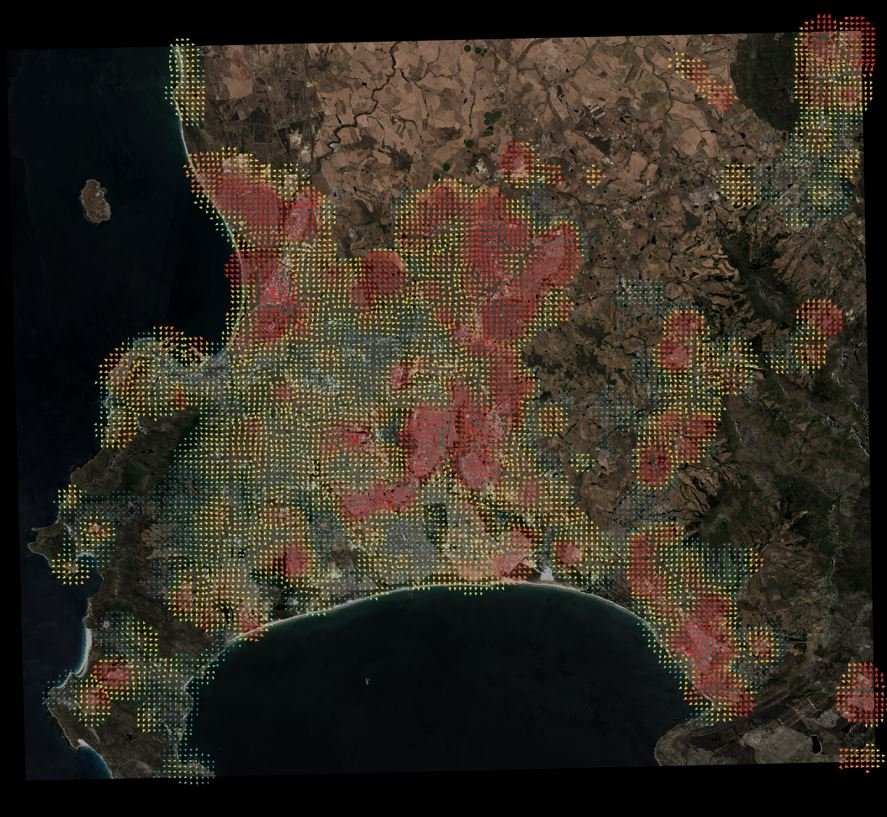
This is the same data but only color coded and vectors showing the direction of growth. Interesting how you can represent the same type of data in vastly different ways.
This one I think is the most clear of all as you can see where new buildings was built over time with the brighter colors showing newer developments over time. You will see this type of image a couple of times, not because I use the same data over and over, but because the scale of the data being used. If you view this image full size then each tiny pixel would be about 10 meters or more. If you would view a zoomed in version of any of the maps you would see a much great pace of accelerated development.
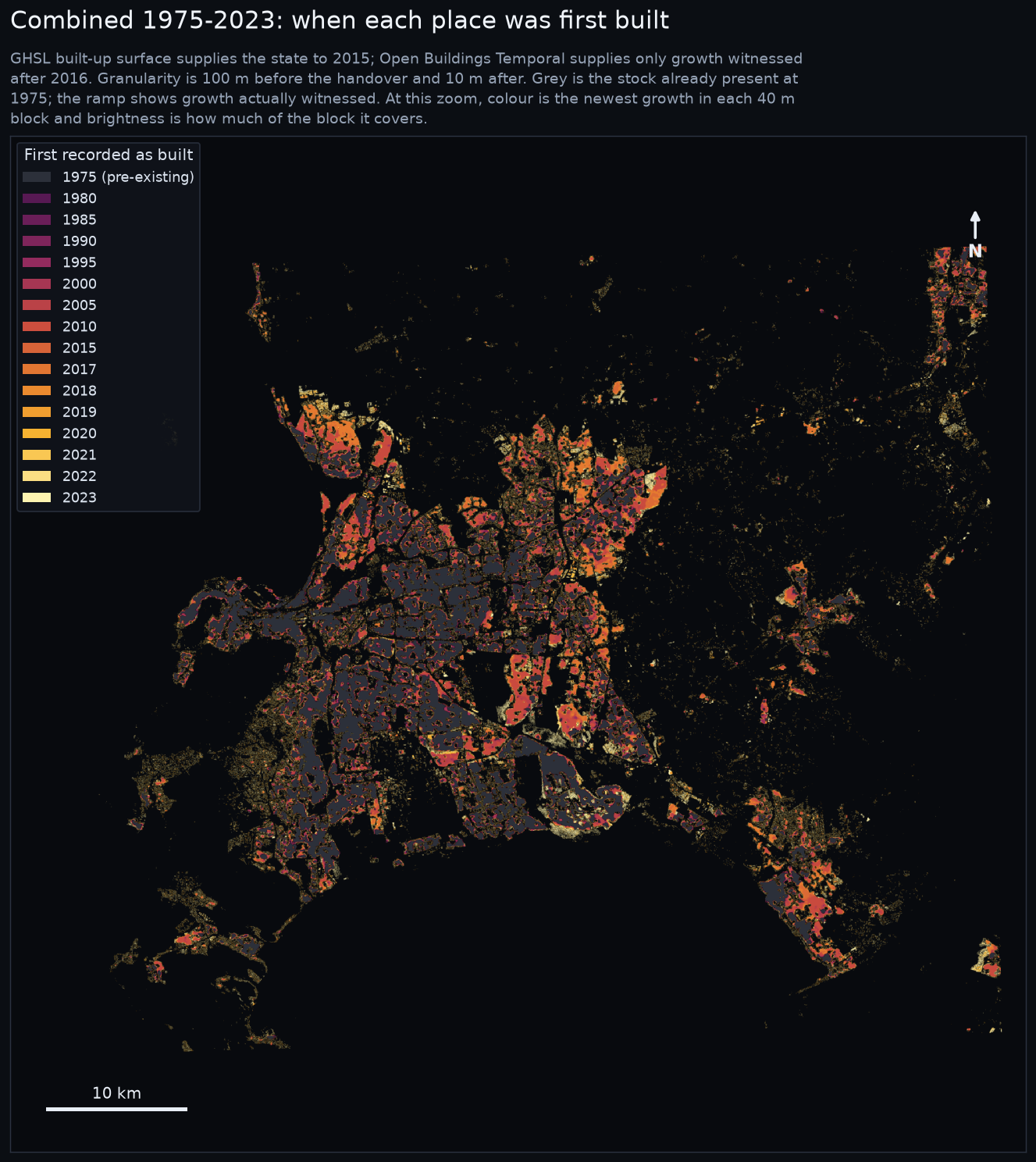
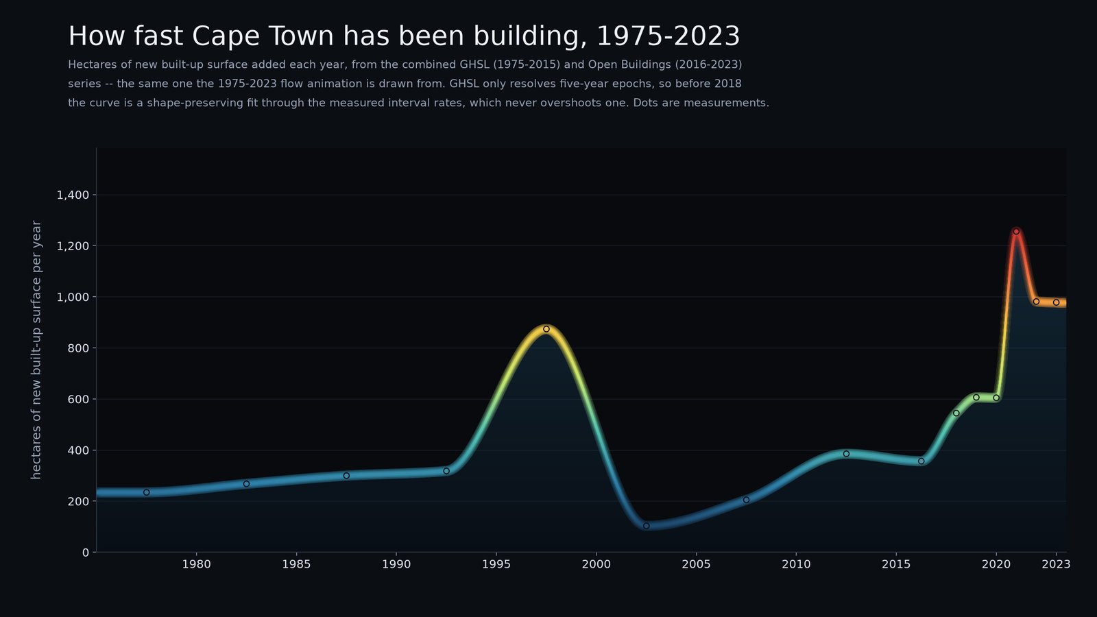
Cape Town’s rate of urban expansion has varied dramatically rather than increasing steadily. Construction accelerated sharply in the late 1990s, slowed in the early 2000s, and then began rising again after 2016. The fastest growth appears around 2021, when roughly 1,250 hectares of new built-up surface were added, before settling near 1,000 hectares annually in 2022 and 2023. The earlier figures are based on five-year GHSL intervals, so they show the broad long-term pattern rather than precise yearly fluctuations. I wonder what happened around about 1994 in South Africa? 🙂
2016-2023
As mentioned above I mostly used the data from 2016-2023 as this was the most complete and continuous dataset I could find. It would have been nice to have access to more data, but this project was project to be going on for a couple of month already and my urge to do multiple projects at the same time was getting stronger by the day. You can see there are a lot more happening in this video compared to be first one. Well for one, its over a shorter time span and two, there where actually more development going on as you will see a bit further below.
One thing I also needed to know was not how much and where development took place but also what direction. No spoilers but I am going to use this later.
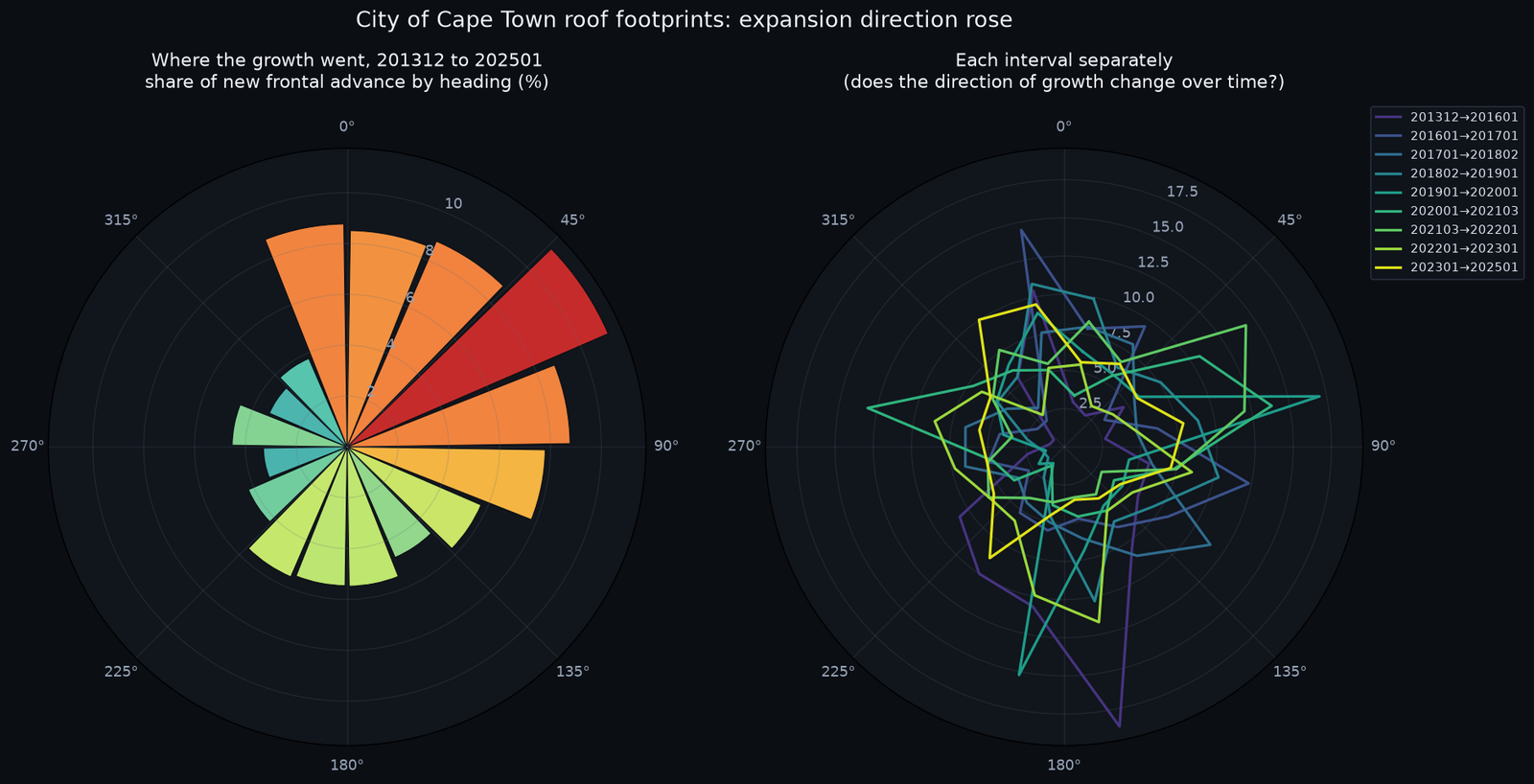
This figure above shows that Cape Town’s expansion has not followed one fixed compass direction. Across 2013–2025, the strongest overall movement was broadly east and northeast, with additional growth toward the north and northwest. However, the period-by-period chart shows those directions changing over time, with some intervals leaning south, west or east. In other words, Cape Town has expanded through a series of shifting development fronts rather than spreading steadily in one direction. However the red shows the major direction most city growth went. If you would overlay this over a map of Cape Town and look at it then it would be hard not to see how development moved away from the mountains like Table Mountain, well I assume because well you can not build on a cliff, mountain or in the ocean so you would need to find places where you can.
Below are the same two type of visualizations as with the more historical dataset. However this time you can clearly see where buildings where being built over time. The highlighted areas are much smaller than before because of the much smaller time frame and thus had less time to build new buildings. You know these things cost money and hard work and time to build.
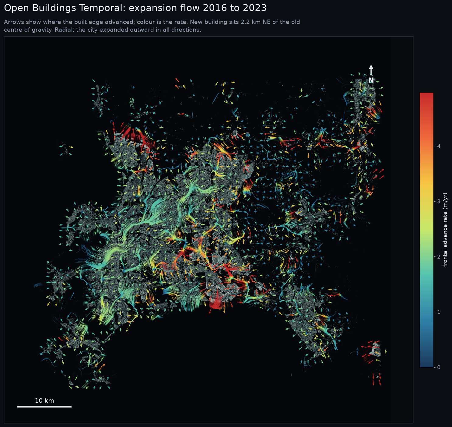
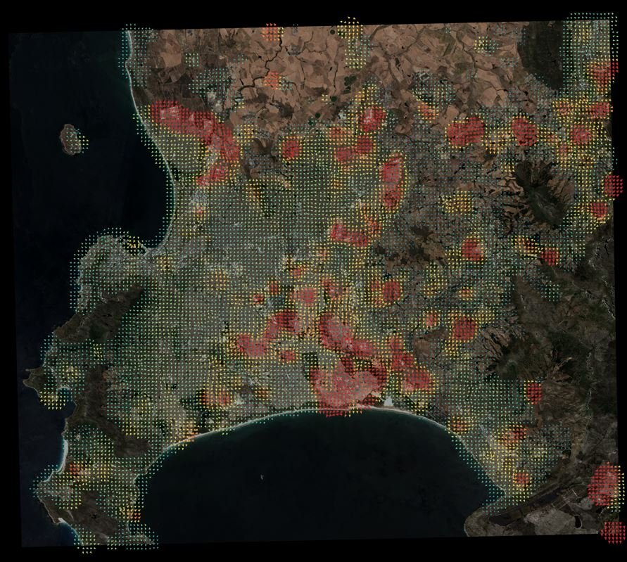
Below I’ve created some zoomed in example of some sections that had particularly high rate of growth. Adding what I call flow lines you can clearly see not just the rate of development, but also the direction buildings where built in. I found it interesting how visualizations sometime used in weather for casting can be applied to building development.

Predicting future growth
Now that we have some idea of what happened in the past we can start to try and predict where future buildings will be built. Unfortunately it’s not as simple as just looking at where things seems to go and just point in the same direction. Well you can, but that seems more like something you would discuss over a braai with a beer than anything resembling a scientific method. I mean sure you can poke so many holes in my approach I can rename this project the Swiss cheese building predictor.
1. Load data
OK, back on track.. I mentioned above most of the data was already converted to actual usable data. Basically neat(ish) X and Y coordinates saying yes, “a part of a building is here or not”. All of this on a really decent 10×10 meter resolution. And over multiple years. Any data nerd’s dream! Don’t you think so?
2 Clean Data -Noise Removal
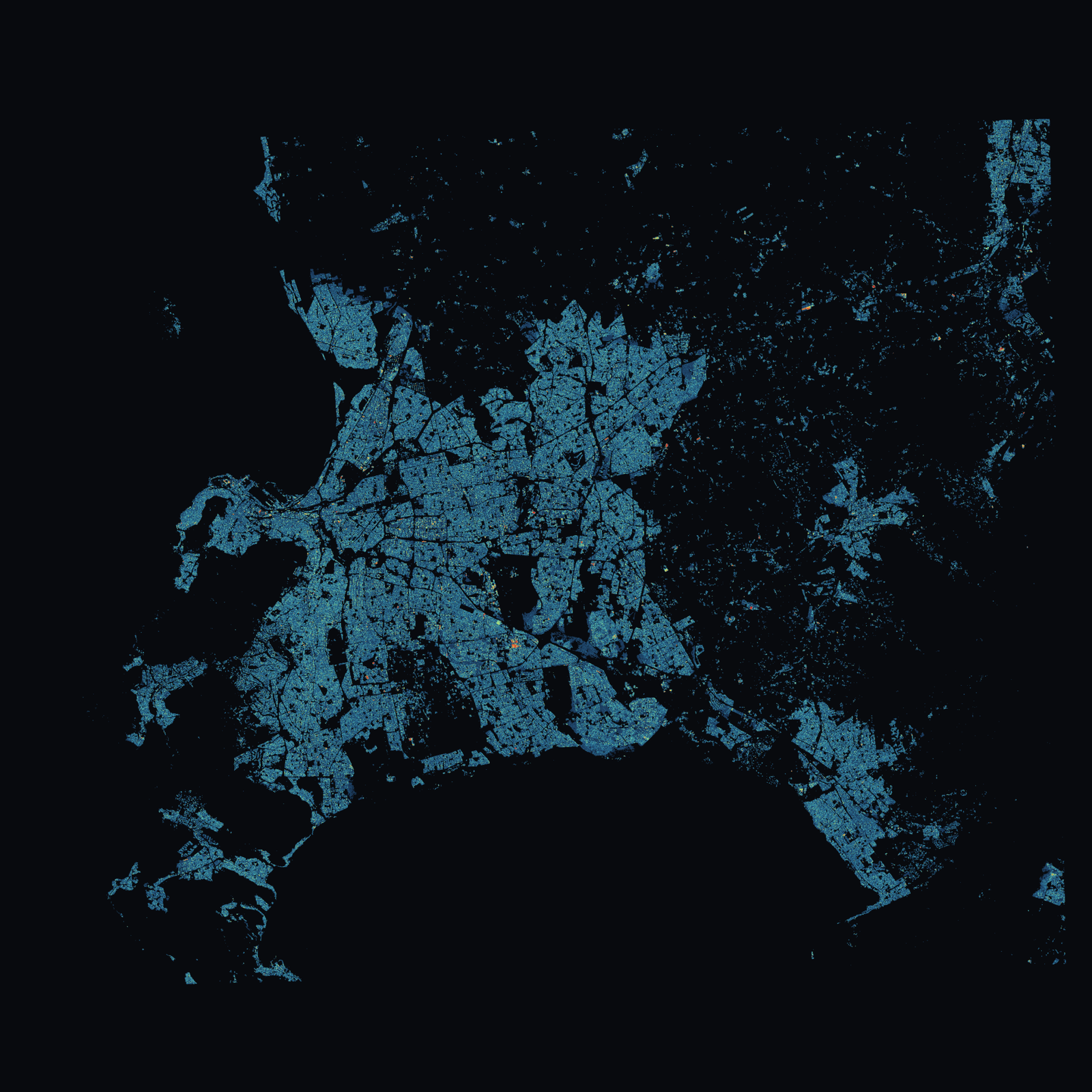
As mentioned above the data is clean(ish) well it actually really is however for my needs I needed to do some additional post processing. Below shows the image of buildings from oldest (bright) to newest (dark). You can already see, same as above some patterns starting to appear but we are getting ahead of ourselves here. We need clean data to work from.

The issue is that the data might be almost perfect, but no data is 100% perfect. There might be noise in the data. It has been gathered from really high up you know. Also someone might have built a temporary structure and took it down after a while, but then that structure would have a permanent mark for the entire range of historical data, even if the structure was just put up and remove on the day the data reading was taken. That would have warped the data a bit, or a lot in fact. So first thing I needed to do was remove all the “blips” in the data and only count actual building that was built and left there. Not just something overnight. The below map shows exactly that. I know the map is zoomed out a bit but you can still see colored spots here and there that indicated something was marked as a building in one time frame and then it disappeared in another. Sure actual buildings do sometimes get demolished however in this time frame I used this was more the outlier than the norm.
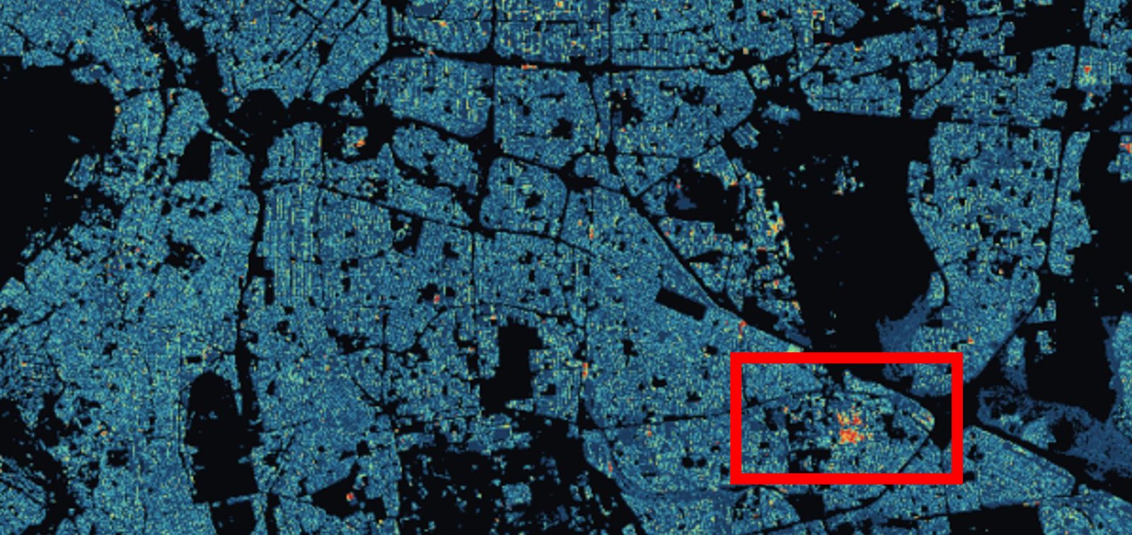
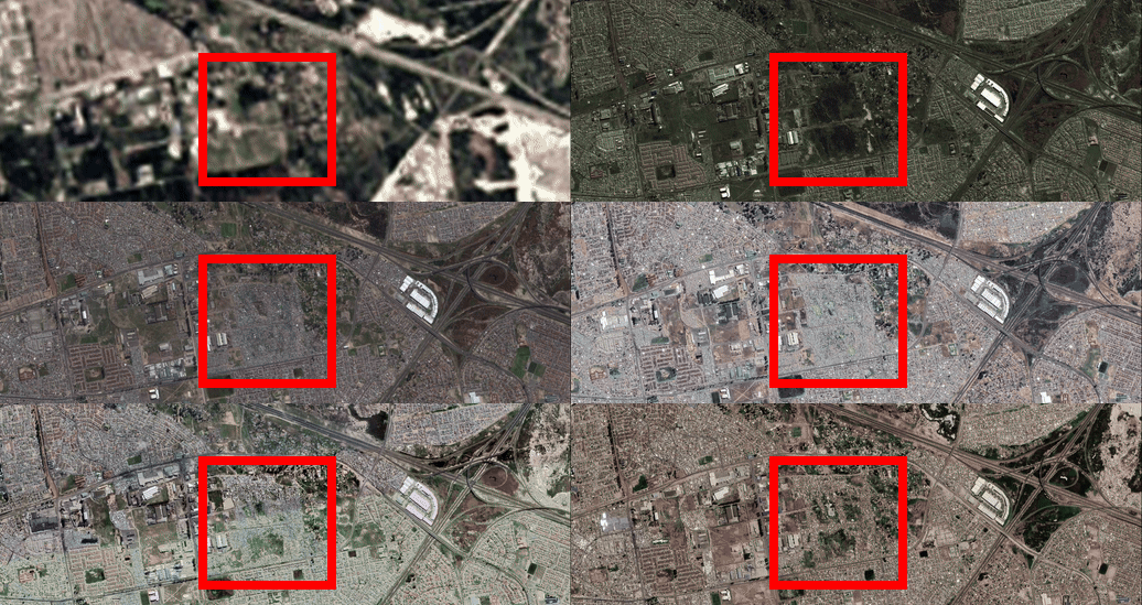
If you spent more than 2 seconds looking at the above image you would have noticed a colorful dot near the middle. Well I spent way more then 2 seconds looking at all the images and I wanted to know more so I decided to find this spot on google earth and see why this spot has so much red and yellow in it compared to surrounding areas. After downloading all the historical data I could find I found that this specific area has undergone a lot of change with building being built, moved and removed on a regular basis. If you look at the time laps below you will be able to make out the area and see the changes being made over time. Keep in mind the time laps was since google started taking satellite photos all the way to the present while the statistical visualization is only from 2016-2023. And since almost every building was individually mapped and tracked over this time you can almost see where buildings where built and then stopped being built due to what I presume is a seasonal flood area. I’m sure being able to spot this kind of change might be useful to city planners somehow.
3. Developable surface
Right now that we have data with buildings that was built and stayed around for the long run we need some additional ingredients in that universal pie of mine. I needed to build a developable surface. And yes that is a real word! It means something different but try and stop me from using it. The idea behind this is I needed to know where building can actually be built based on the available terrain. I mean you can not build on the side of a cliff, nor can you build in the middle of a river. So where can you build then? Well thanks to all the information from the multitude of data sources I was able to take my pick from the best data sets.
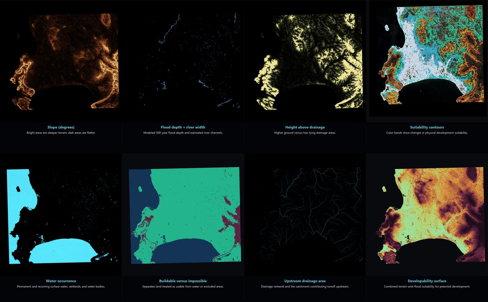
After looking though all the images and datasets I decided to use the following to build my developable surface map.
- Slope degrees : Shows terrain steepness. Bright areas are steeper; dark areas are flatter.
- Flood depth and river width : Shows areas affected by a modeled severe 500-year flood. Also shows estimated river channels and their widths. Brighter or thicker lines indicate larger channels or stronger flood features.
- Height above drainage: Shows how far land sits above nearby drainage channels. Darker areas are low-lying drainage zones; brighter areas are higher and generally less flood-prone.
- Suitability contours over satellite imagery: Shows colored contour bands representing changes in physical development suitability across the terrain.
- Historical water occurrence: Shows locations where surface water was observed regularly or occasionally, including coastal water, wetlands, and scattered water bodies.
- Buildable versus impossible land: A categorical mask separating land considered physically buildable from water, excluded areas, or locations treated as impossible for development.
- Upstream drainage area: Shows the river and drainage network, with stronger/larger channels representing areas receiving runoff from larger upstream catchments.
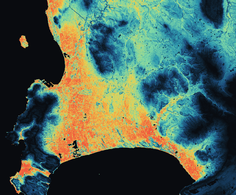
By combining all the maps into one I had a map where buildings not only could be built but also built safely. This map is not just black and white either. Since you can still build on the side of hills if your bank account is big enough. And technically you can build on top of table mountain, however since height is a factor worked into the final map also it would be very impractical to build on very high areas. Interesting enough from this map you can see Robben Island seems to be the perfect place to build, seeing that I did not take into account you need to travel over water.
Step 4 AI model to predict where buildings will be built.
So we now have the where can we build. But now we also need to know how buildings are being built. As in what pattern buildings will form based on existing buildings. If you have six identical buildings next to each other the chances are good the seventh will be built right next to number six. Or if you have a block of four buildings opposite each other from another block of four buildings you can assume should another set of four buildings be built next to the existing ones the fourth set will be right across the road and so on. Basic pattern recognition. I opted for a basic logistic regression model as this I thought would give me the best results and any other model might have been overkill. Hindsight is 20/20….
Model input
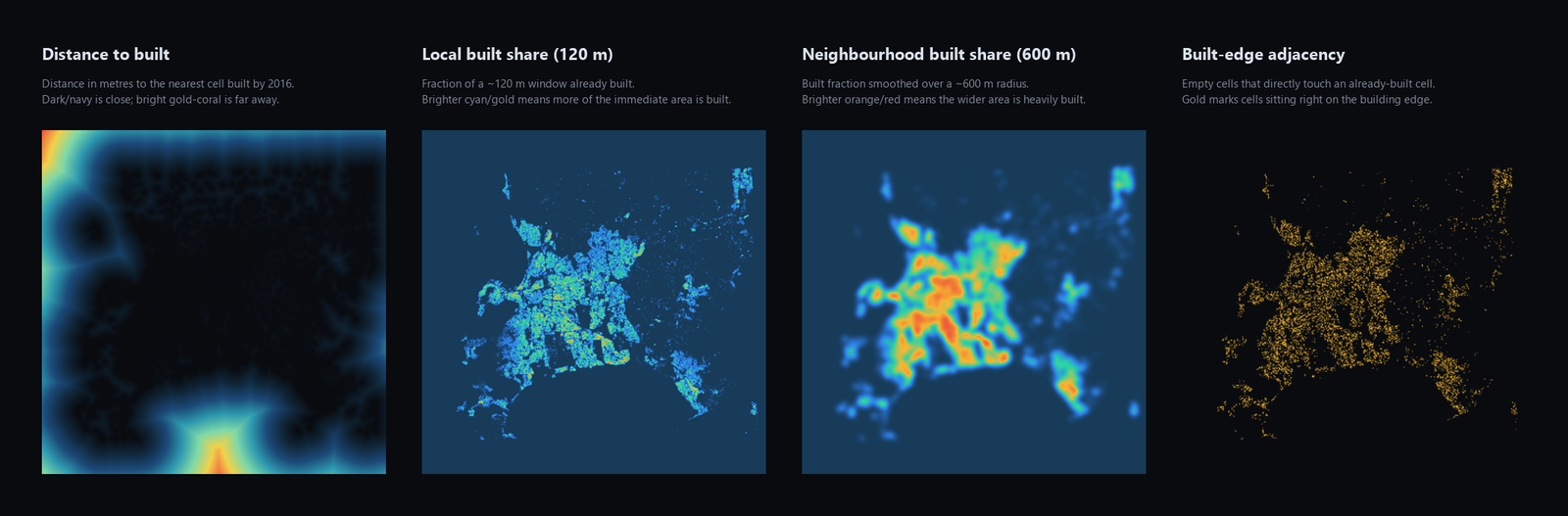
I opted to use four inputs to the model. Each one I has to create based on the existing data.
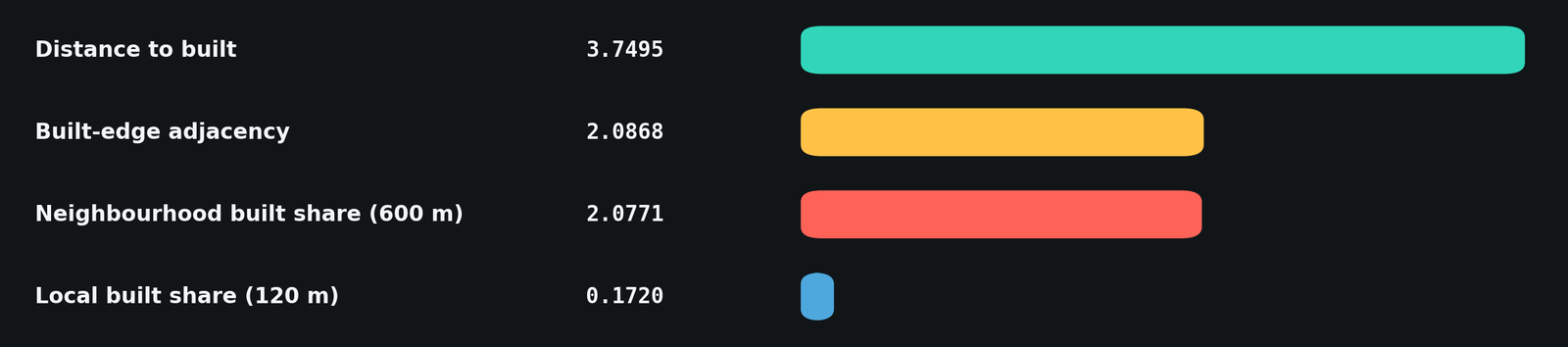
Distance to built is a straight line distance from each empty cell to the nearest cell already built, computed on a coarsened grid to keep it fast across a century of simulated steps. It’s the single strongest predictor of the four. Rather than assume distance matters in one smooth way, the model sorts it into bands (very close, close, a few hundred meters, and so on) and learns a separate weight for each. Past 3 kilometers the model treats the chance of building as flatly zero, since that matches what the historical data actually shows.
Local built share looks at roughly the nearest 120 meters and asks how much of that immediate area is already built. This one turned out to be the trickiest: naively, cells surrounded by dense building get built far more often than cells surrounded by empty land. But once you only compare cells that already sit right on the built edge, that gap mostly disappears. An earlier version of the model didn’t correct for that and ended up predicting new growth filling in whole street networks inside already built suburbs. This version fixes that by learning the effect directly from the data instead of assuming it.
Neighborhood built share asks the same question over a much wider area, roughly 600 meters, and blends smoothly across space rather than switching on and off at a hard boundary. It captures something different from the 120 meter version: not whether a cell is hemmed in locally, but whether it sits in a generally dense or generally empty part of the city. The model is told that this effect can only ever push the build chance up as density rises, never down.
Built-edge adjacency is a simple yes or no: does this cell physically touch a cell that’s already built. It’s kept separate from the distance measure because the jump in build likelihood right at the built edge is sudden rather than gradual, so folding it into the smooth distance curve would have hidden a real, sharp effect.
Model results
Below are the results of the model I trained to try and predict where buildings be built based on existing buildings. Keep in mind, this does not include terrain at all. This model assumes everything is built on a flat surface. The model performed well at identifying the general areas where future development was more likely, clearly outperforming random selection. It was less reliable at predicting the exact cells that would be built, so it works best as a broad growth-pressure map rather than a precise building-by-building forecast.
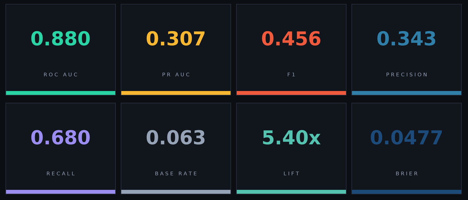
ROC AUC : 0.880: The model is very good at ranking places that were built on above places that remained empty. A score of 0.88 is strong, although not perfect.
PR AUC : 0.307: This measures performance when new construction is relatively rare.
F1 score : 0.456 : This balances finding real construction with avoiding false alarms. The result is moderate: useful for identifying likely areas, but not reliable enough to predict every individual site.
Precision : 0.343 : About 34% of the locations flagged by the model were actually built on. That may sound low, but it is substantially better than selecting locations without the model.
Recall : 0.680 : The model found about 68% of all the places where construction occurred. This is good coverage, although roughly one-third of the real growth was still missed
Base rate : 0.063 : Only 6.3% of the available locations became built during the observed period. This shows why the prediction is difficult: genuine building growth is uncommon compared with all the land that remains empty.
Lift : 5.40× : Locations selected by the model were approximately 5.4 times more likely to experience construction than an average available location. This is a strong and easily understandable sign that the model adds useful information.
Brier score : 0.0477 : This measures how closely the predicted chances matched what actually happened, with lower values being better. The score is reasonably good, but it does not mean every individual probability should be treated as exact.
Interestingly enough distance from existing buildings was the strongest influence. Built edge adjacency and wider neighborhood density were also important, while immediate local density contributed relatively little. Interesting how the 120m build share almost adds nothing to the final models score.
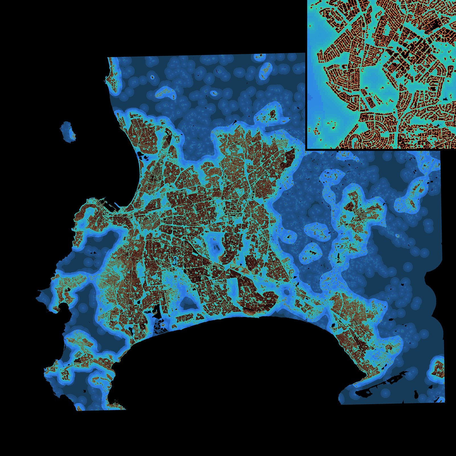
Below is a visualization of the model output. if you would have run the model on each area of the map. In itself its not very useful, but it still give you an idea of what the model attempted to predict. Light blue is where buildings most likely would be built while darker areas are less likely. As I said before, this in itself is not very useful as no terrain was taken into account nor growth rates of any kind. But still pretty to look at.
Step 5: Building the final predictive suitability map
So our final map of where buildings will most likely will be built is coming together nicely. Mixing the final batch and putting the pie in the oven. We now have a developable surface showing where it’s physically possible to build, a map showing where buildings are likely to be built based on past and existing buildings. Or in other words how much pressure the existing buildings add to where new buildings might be built. And lastly we have the directional preference of the general direction buildings tended to be built in based on historical data.
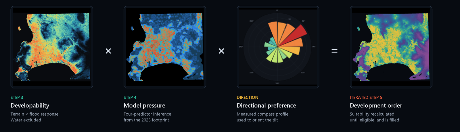
Combining all of this give you a map that shows where buildings actually might be built. Now you can not just use photoshop and merge all the data and get your final map. No.. (I have tried) you need to predict one cell (a 10×10 meter section) at a time. Then repeat the process over and over and over until the whole map is filled. Lucky for me you can just run this in a for loop and watch the magic happen.
For interest sake below is the actual formula is above and I promise this is the only one you will see in this blog if I can help it.

The suitability score for each candidate cell combines land availability, historically observed development patterns, proximity to existing buildings, and the dominant direction of urban expansion. Developability acts as a spatial constraint, reducing or eliminating the score of cells where construction is unsuitable, including water and already occupied land. The distance, local built share, and neighborhood built share terms are weights learned from the observed change in building footprints between 2016 and 2023, representing how development likelihood varied with distance from existing structures, built density within 120 meters, and wider development intensity within 600 meters. The adjacency term adds a fitted coefficient of 2.0868 when a cell directly touches existing development, reflecting the strong tendency for new construction to extend outward from the existing built edge. These model components are combined exponentially to produce a positive development pressure score. A directional adjustment is then applied using the angle of each cell relative to the existing urban area. The value 45.4° represents the observed dominant growth direction, approximately northeast, while the coefficient 0.4 limits this directional influence to a maximum increase or decrease of 40%. The resulting value is a relative suitability score used to rank eligible cells for development, rather than a direct probability that construction will occur.
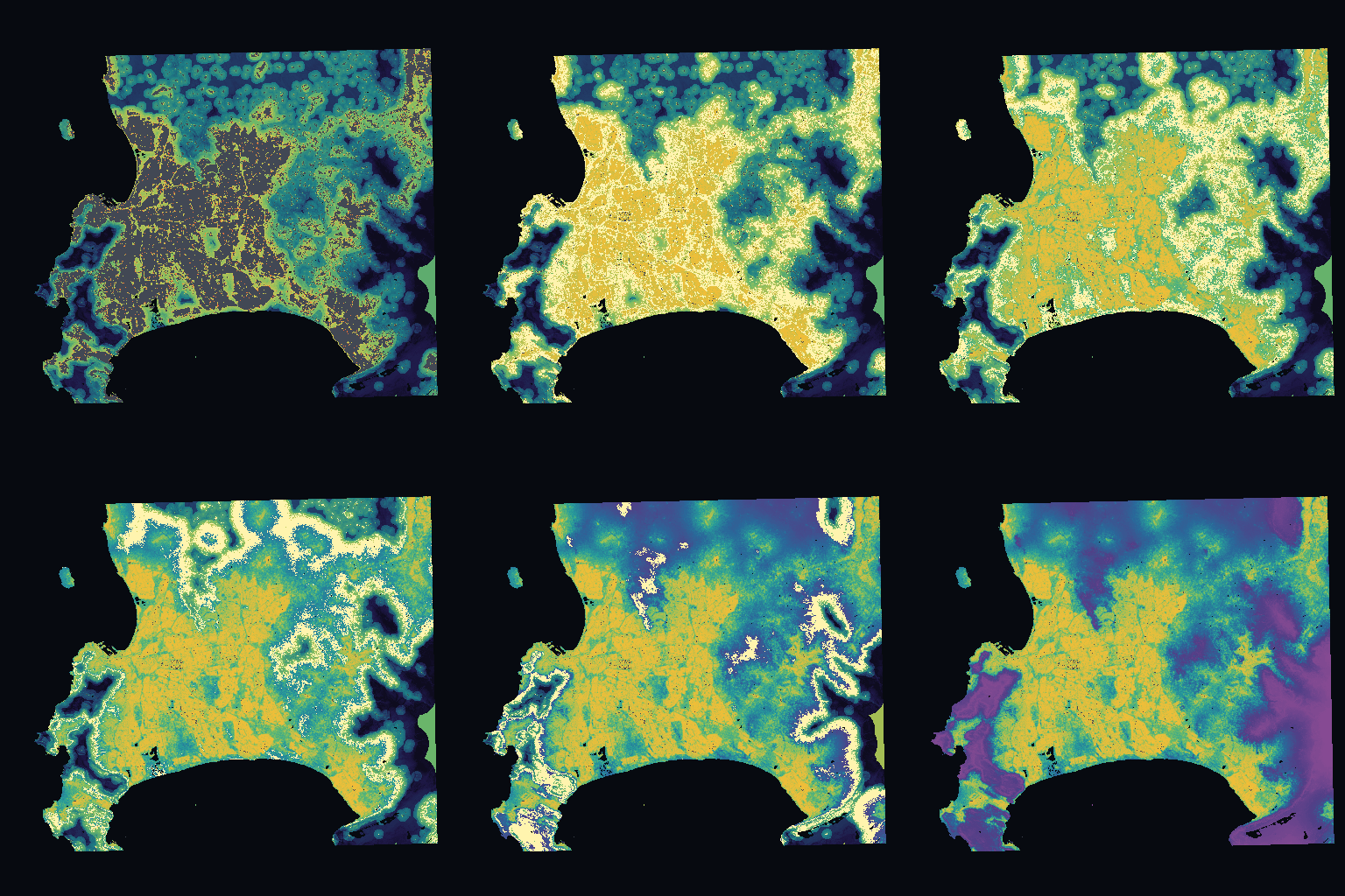
And here above you can see the final map being formed. I could have just shown the final map, but seeing how it’s being generated look really cool and I spent more time looking at this than what I would admit.
Step 6. Testing the final suitability map
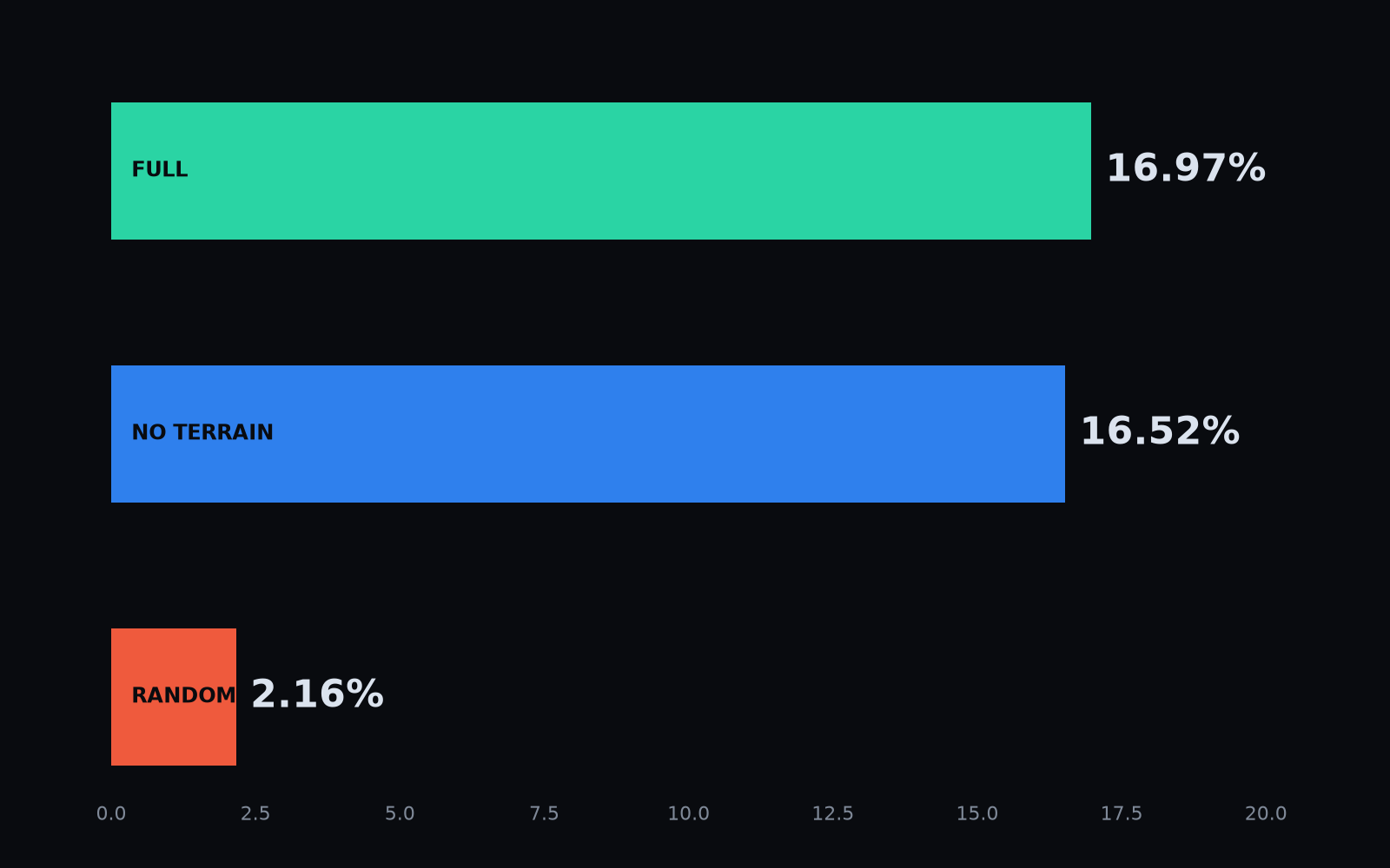
Great.. now that we have the final map we need to see how good it actually it. And I will tell you know, not very good, but there is a catch though, but we will get to that. Below is the raw numbers. It managed to predict a amazing 17% of all the new buildings. If you remove the terrain map it was a little bit less, but still much more then just randomly guessing. Keep in mind this is predicting where buildings will be on a 10×10 meter grid. If the model predicts a buildings will be 10 meters to the left instead the right it would have counted as incorrect. In hindsight I might have changed the model to be a bit more general and perhaps changed the grid size to 1km instead of 10m but you know it is what it is and I have other project to keep my busy.
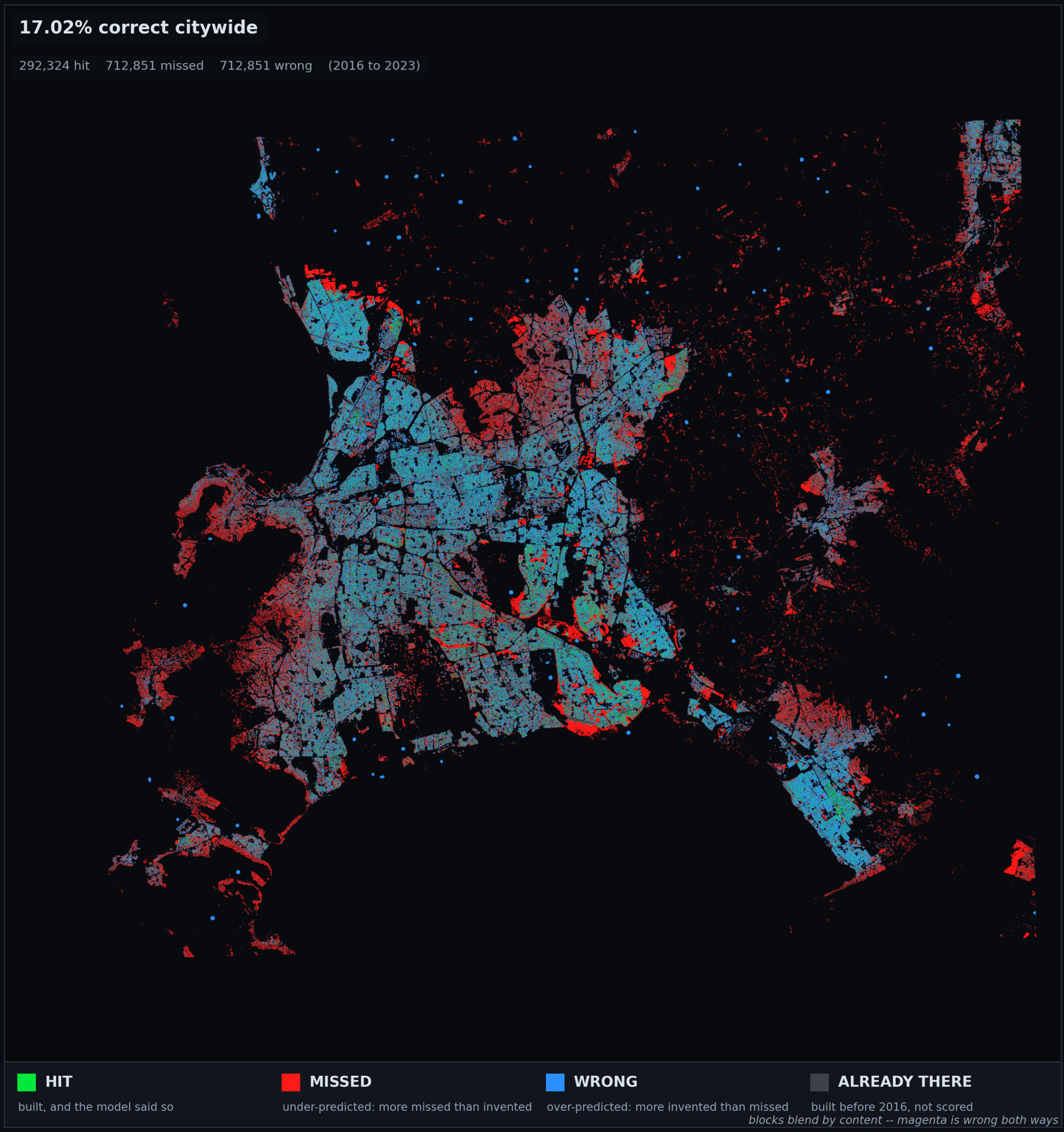
Below you can see all the areas in red that it missed or got wrong while the blue where where areas where it either predicted mode accurately or where existing buildings where outside of the predicted time frame. And yes I will admit I did use the same training data to also predict on and only keeping a very small sample set out for the final prediction. Should this have been for actual production use case I would have spent months on just the model alone to get it as accurate as possible.
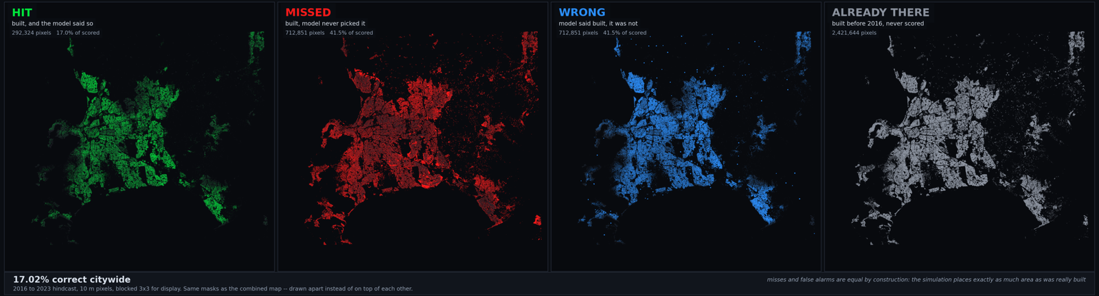
Here you can get a more clear picture of where the model got things right and where it missed or just got it completely wrong. The above map does not show things clear enough so I split each prediction into its own section so you can see where is a lot of overlap because of the small scale the model was told to predict at.
As you can see below it sometimes missed whole sections of new building areas where other places it actually got some right. Again asking the model to predict the location and shape of each building was perhaps to much of an ask. I should have gone with here is a 1km square, will buildings be here or not.
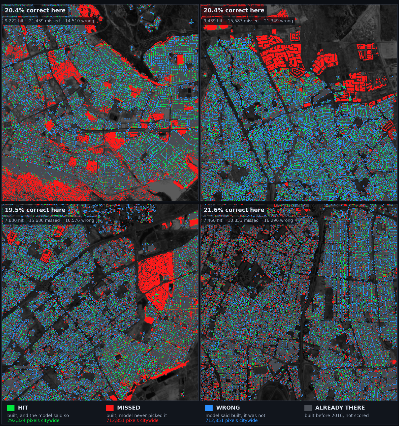
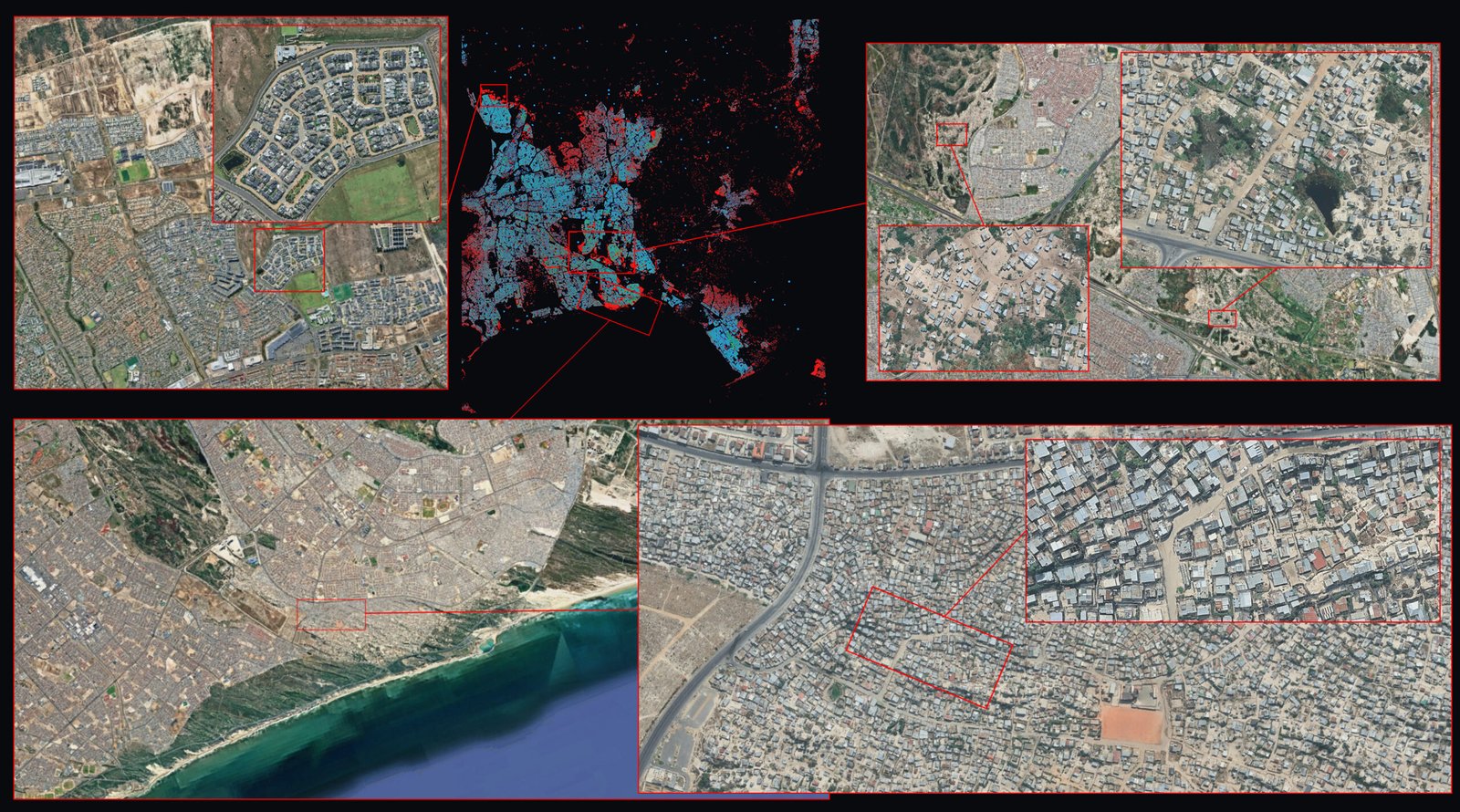
Looking at the above reference where the model missed large sections I started thinking. Why did it miss some sections completely while getting other sections mostly right? Well I decided to do a little bit of a deep dive into the areas that was almost completely red. After comparing the map above, google maps and flying around about I managed to link the red areas with the exact location on google. What I found was rather interesting. Yes the model is not very good. That is a fact, however what I found below might also explain some of the reason why. Without further testing I can only claim that this my theory from working with other models in the past. If you look at the areas where the model missed or miss classified whole sections you can see the buildings are not built in a traditional pattern. As explained earlier the model was trained and learnt specific building patterns. Another building should be next to a line of similar buildings. Townhouses looks the same in most cases. However buildings built in the last while sometimes did not follow this pattern. If you look at the zoomed in areas you will see they are either built mostly random or follow a pattern that was not traditionally used in the past so the model was not able to recognize the pattern and thus got complexly confused. Even though it’s just my theory I think its an interesting observation none the less.
Step 7 Determine growth rate
Right, I think I had put the pie in the oven to soon as we needed to add yet another ingredient in the mix. Since we now know where builds might be built in the future we still need to know how fast buildings are being built. Is it one building per year or one hundred. To calculate this I just took the buildings from 2023 and subtracted the buildings from 2016 and found the difference. Then all I had to do is calculate the total average of this and you get your average growth rate for this period.
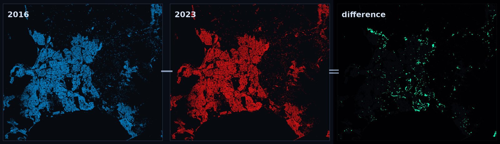
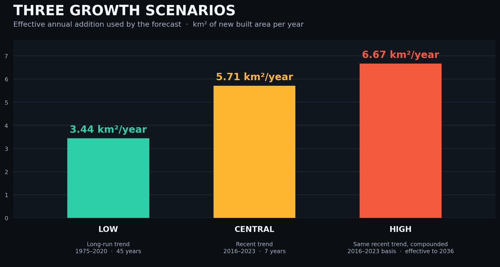
What I found was in this period over 7 years the growth rate was 5.71 km squared per year. This meant if you take any spot on the map and predict how much would be built there it would be about 5.71km on average. Sometimes more, sometimes less. I also did the same for the more historical dataset of 1975 to 2020 and that turned about to be 3.44 km squared per year. Using this trend I did a basic time series to project to the year 2036 and got 6.67 km squared per year. Since I was working with the 2016-2023 time set and this was the middle between the two I decided to use this to predict the final city growth.
Step 8 Future Prediction
Right, now the pie was in the oven and we can finally see how it came out. Well more accurate it’s still in the oven and you are sitting in front of the oven watching oven TV while your mom tells you not to touch or open the oven’s door.
As you saw with the colorful map animation above that looks mote like bacteria in a petri dish I have to predict each time frame one after the other so the last prediction can form part of the next prediction and so on. For time frames from 2023 (as this was the data I had available) until the year 2076 I predicted each year. I then decided to take things a bit further and predict until the year 2120 where I will either be uploaded to the cloud, dead or not be able to recall this blog whatsoever. So any prediction right or wrong wont really come back to bite me. Regardless I decided to only then predict in a 10 year gap instead of one year since my computer’s CPU and GPU was applying for leave constantly already at this point.
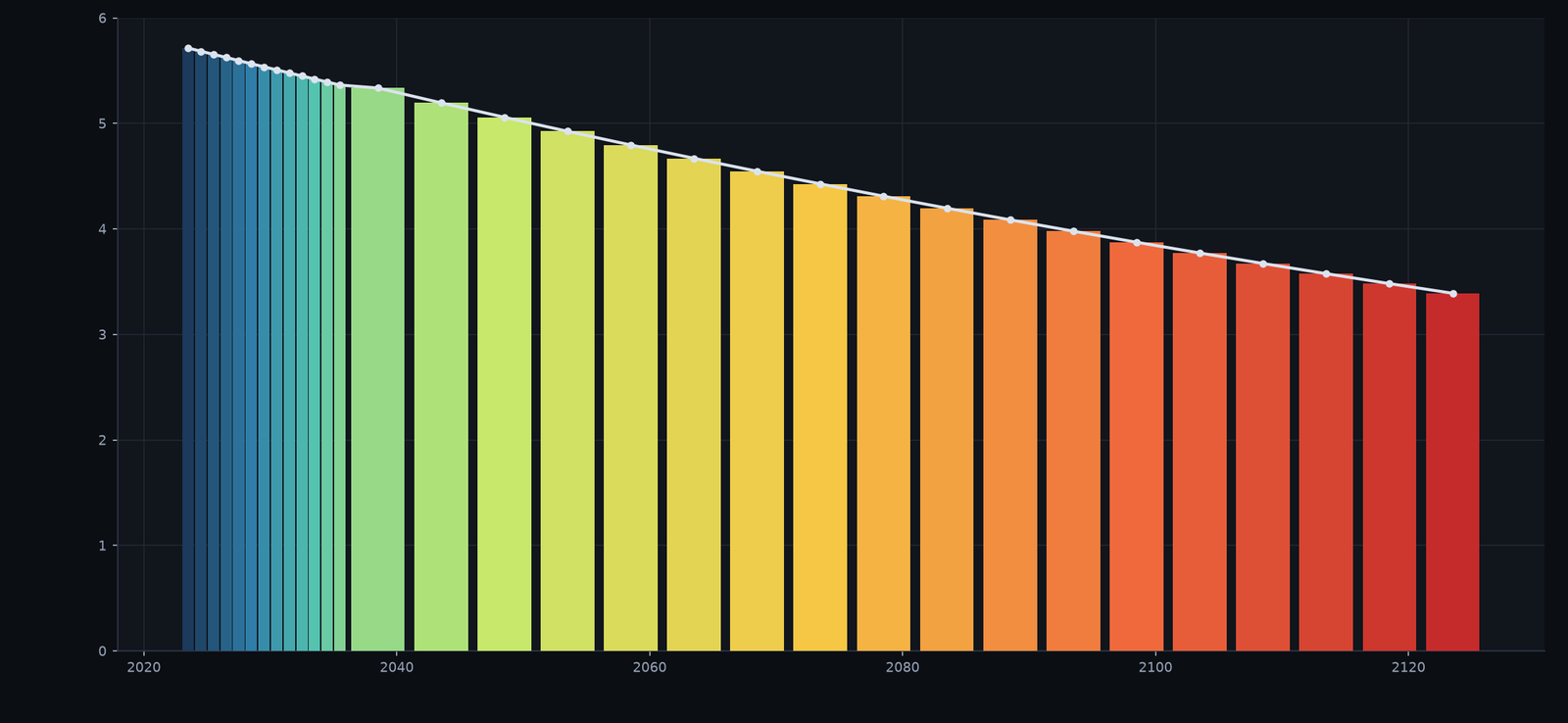
And finally below you can see the predictions for the year 2026, 2036 and 2076 with green to red showing each time frame. It does not look that impressive, however you have to keep in mind the growth rate and because of the scale 5.71km only covers a couple of pixels at this scale. Still just looking at this you can already get some worth while information from this. Smaller towns outside of the big city starting to grow and existing areas encroaching even further to the mountains until the slope stops it in its tracks. Areas where the land is more flat you can see more spread.
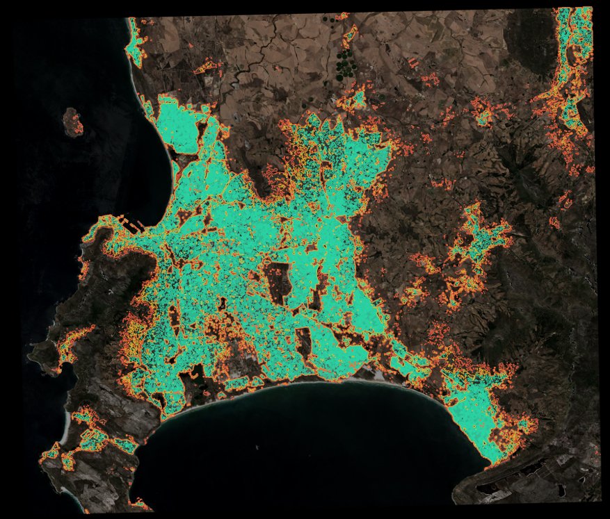
I was interested to see how much of a difference the terrain made in this prediction so I decided to again run forward loop to the end of time or just until the whole map is filled. Instead of just stopping at the above date ranges I decided to just let it run to see how it will look if you got in a time machine and sped up time. The video below shows the two scenarios. One that uses the terrain as an influence on the left and the one on the right does not take the terrain into account and assumes the land is just a flat pancake. Even halfway though you can see the terrain actually does play a huge role in where buildings can be built, and that the model takes this fact into account when planning future growth. I know I’ve covered this in previous sections, but its interesting to see it visually demonstrated.
You also might be wondering about the “stars” popping in and out. This is part of how the model predicts growth. A new town might spawn in the middle of nowhere. And the random dots are the model placing random “spawn points” randomly on the map. However most of them die out almost immediately as either either on the side of a cliff, in the middle of a river or nowhere near any other buildings. A town most likely will not grow if you put a garden shed in the middle of nowhere, but a small town might start to develop if its close by another small town for example.
ATM BRANCH PREDICTION
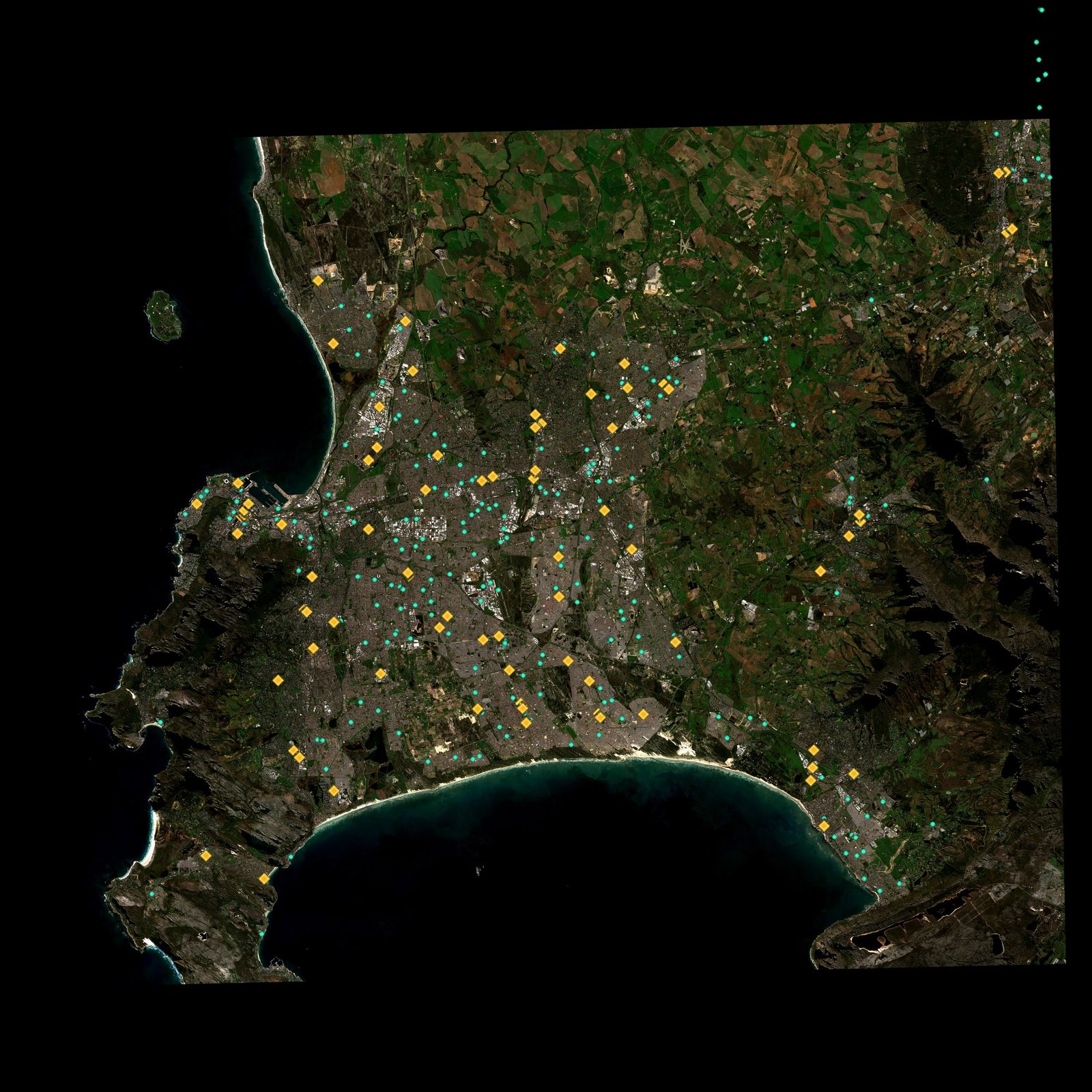
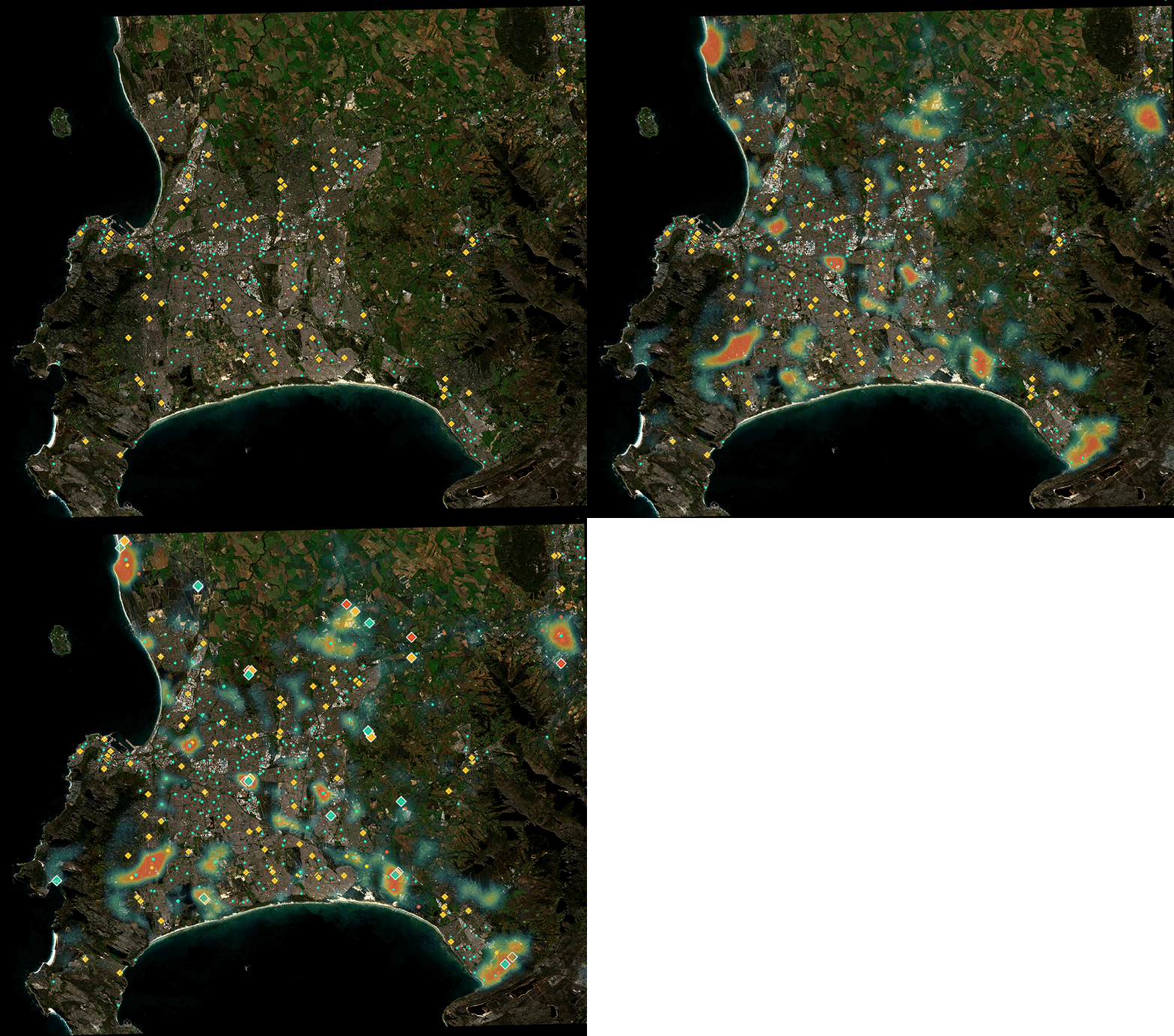
Well not it’s time to finally eat the pie. Lets go and do what I initially tried to answer all those many pages ago. Given the growth Cape Town in the future where would you build your next set of bank branches and ATMs? Well I took one banks currant layout of their ATMs and branches then mapped it over the test area. Luckily for me by getting the information from the bank’s own website and correlating this with google maps I managed to get a semi decent idea of where they are located. The cyan shows where all the ATMs are located and the the yellow shows the locations of the branches.
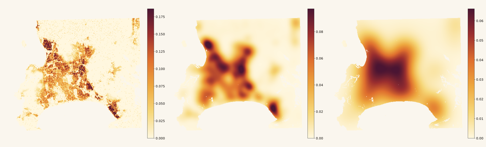
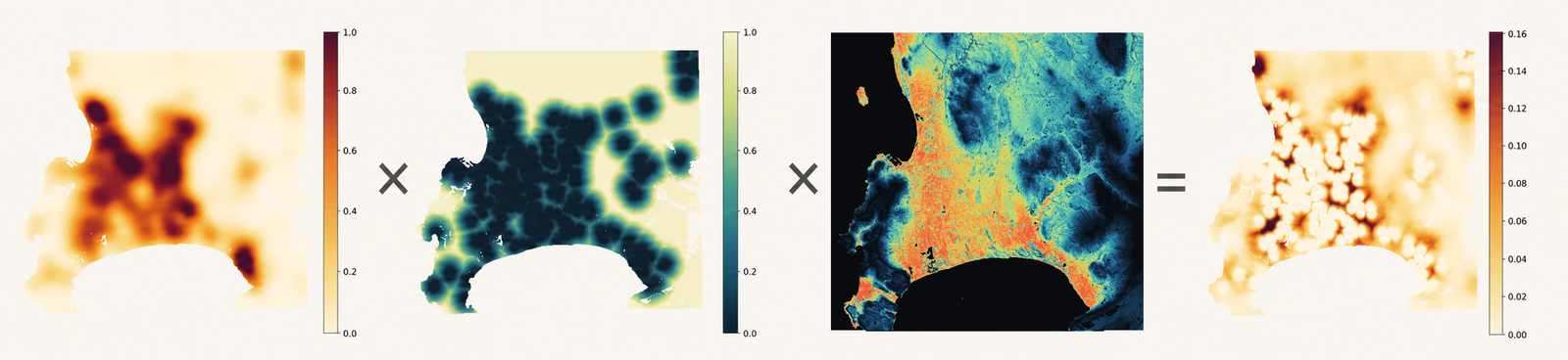
So where would you want to build ATMs and Branches in the future. Well this is what we all came here to find out. First I took the final foretasted map generated in the previews step and blur this twice to get an estimated demand catchment area. Once for the ATMS to cover about 1.5km and secondly a 4km local catchment for the branches
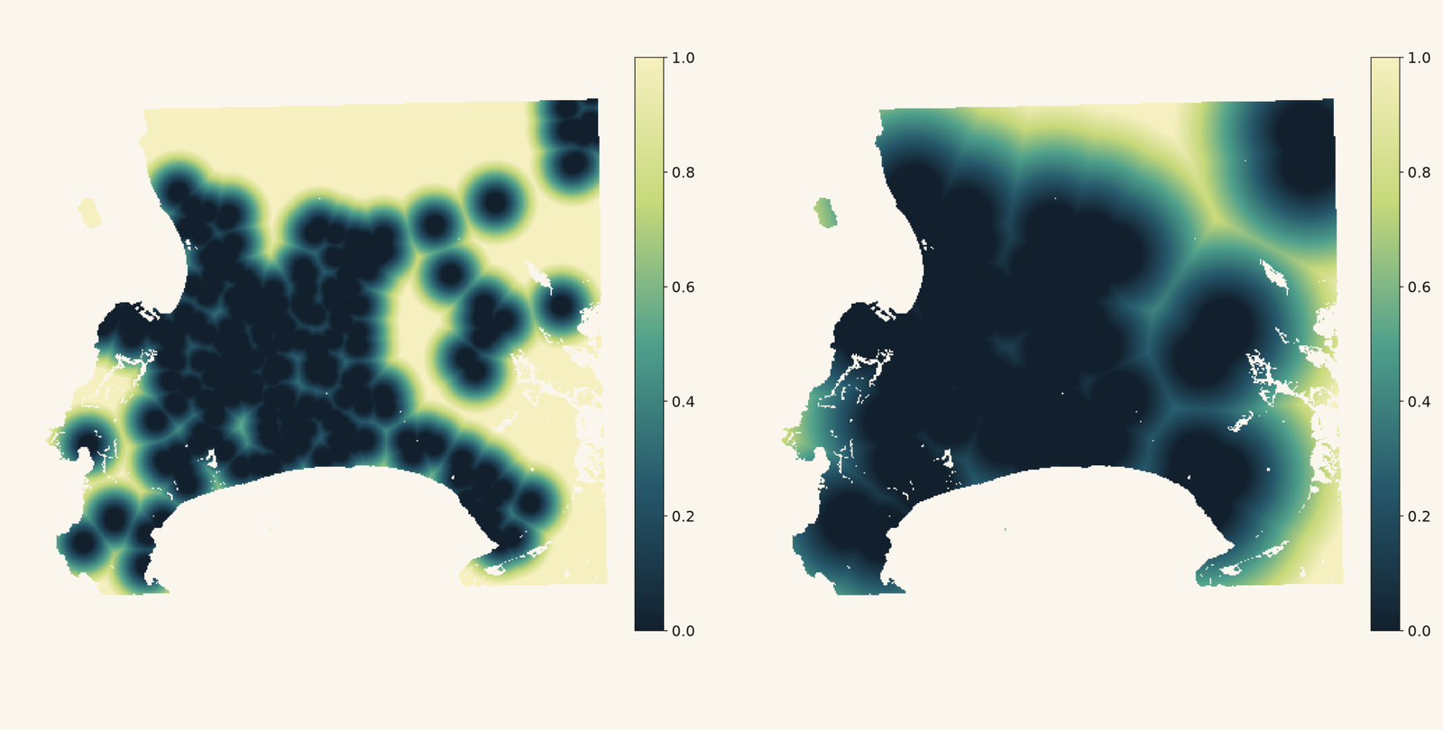
Next I needed a indication of how close each existing ATM and Branch are from each other. This is rather simple. The further an ATM or branch is from each other the brighter the color.
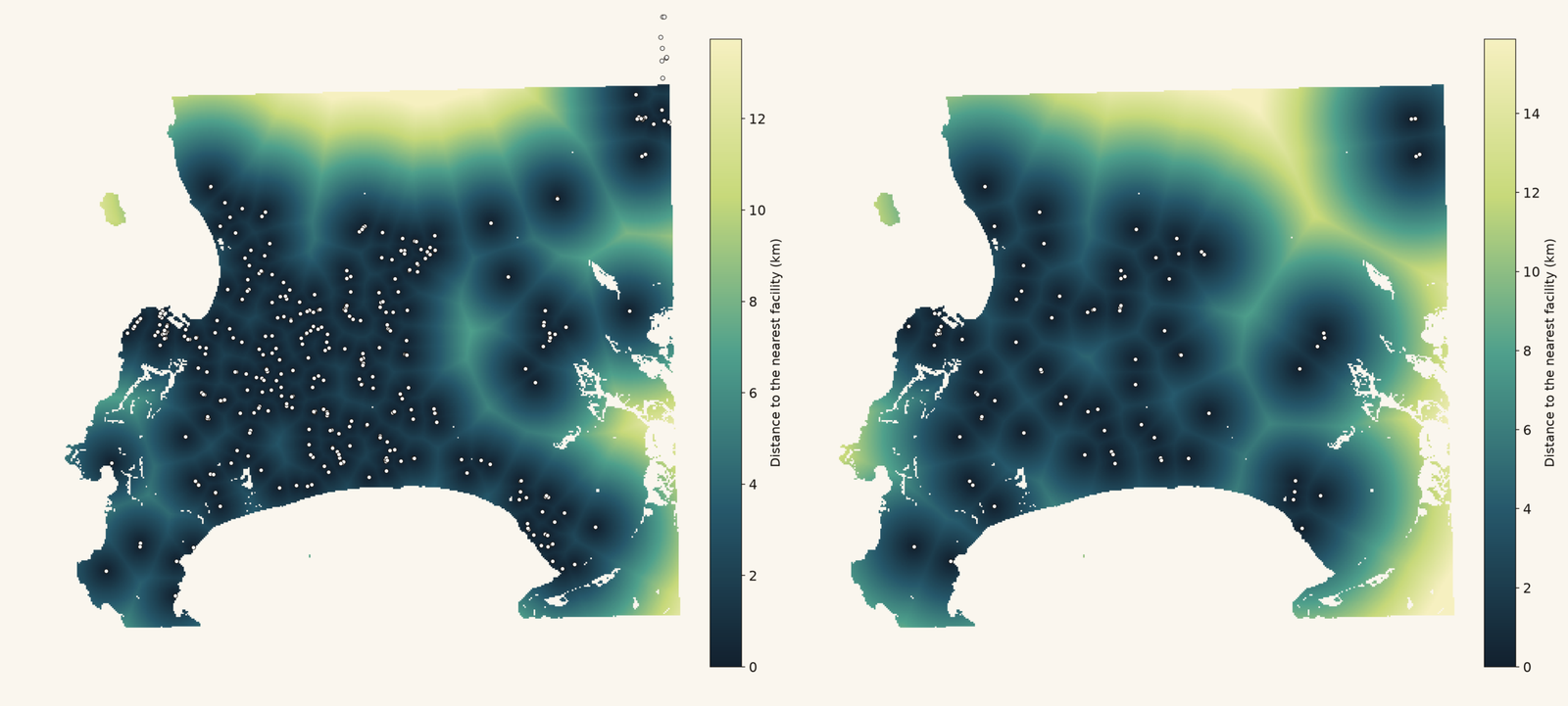
The real useful information comes when you take the map above and you convert it into a distance gap map. Yes I know I need to work on naming stuff, but this give you the best idea. Using a cut off threshold of 1km for ATMS and 3km for branches you then get a good indication of areas that is not being covered by either.
Once we have this we can combine the estimated demand catchment area map, the map showing gaps where no ATMs or branches are AND the developable surface map (I mean you don’t really want to put an ATM on top of a mountain). This then gives us an final map showing where one might need to look into putting ATMs or branches in the near future based on how Cape Town is growing.
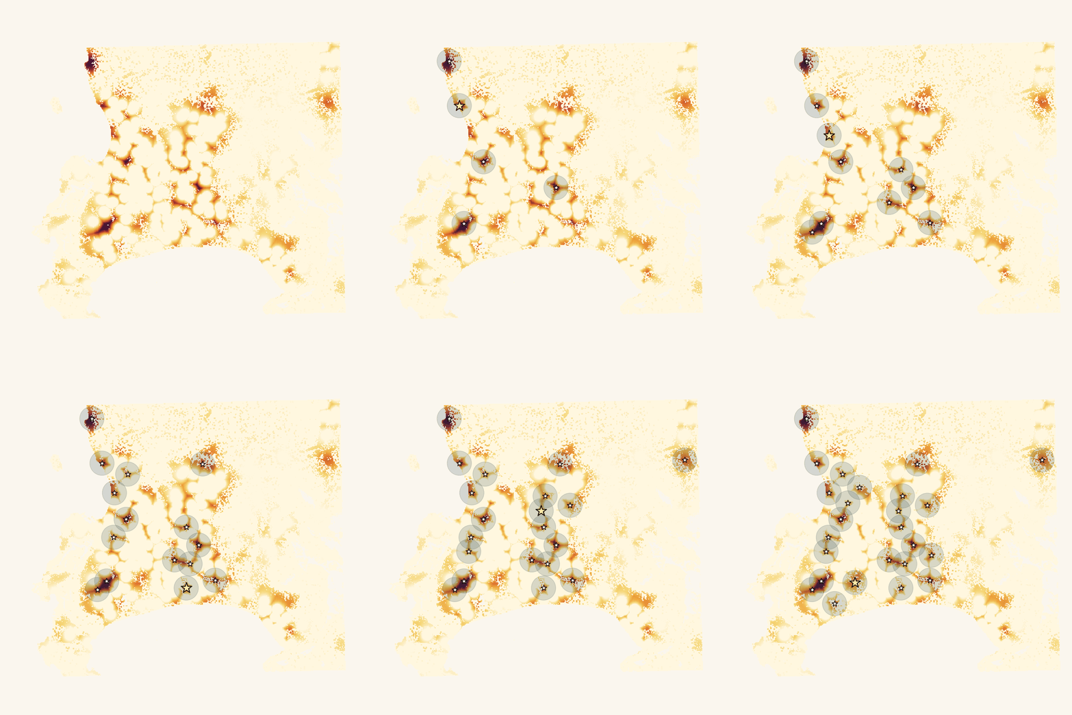
Now the map above just gives you high lights, however you also need consider other things like not putting 3 branches right next to each other. Yes I know most places have multiple ATMS in one area however for this exercise assume one ATM location counts can also mean a group. So the final step would then be to take the most concentrated area, check if there is an ATM or branch in nearby and if not place an ATM or branch in that spot. Then move on to the next most dense area until you can not place any more without major overlap.
For ATMs I chose to use a 2.5km radius and for branches I used 8km. You will see there are some overlap especially with the branches. This is because the concentrated areas took preference over overlap. So in other words if the was a high density area with no branch the function would place an branch there even it of mean some overlap with nearby branches that did not cover that specific area.
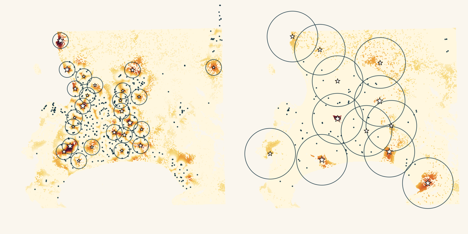
The above map was based on 2036 however I also mapped this to 2076 and 2126 just to see where in the very far future one might look to place ATMs or branches. Even with these 3 maps you can also make out the future predicted growth of Cape Town.
The first image is showing the ATMs and the second the branches for the same time period. You can see they do not stay the same predicted locations as the most dense areas do change over time.
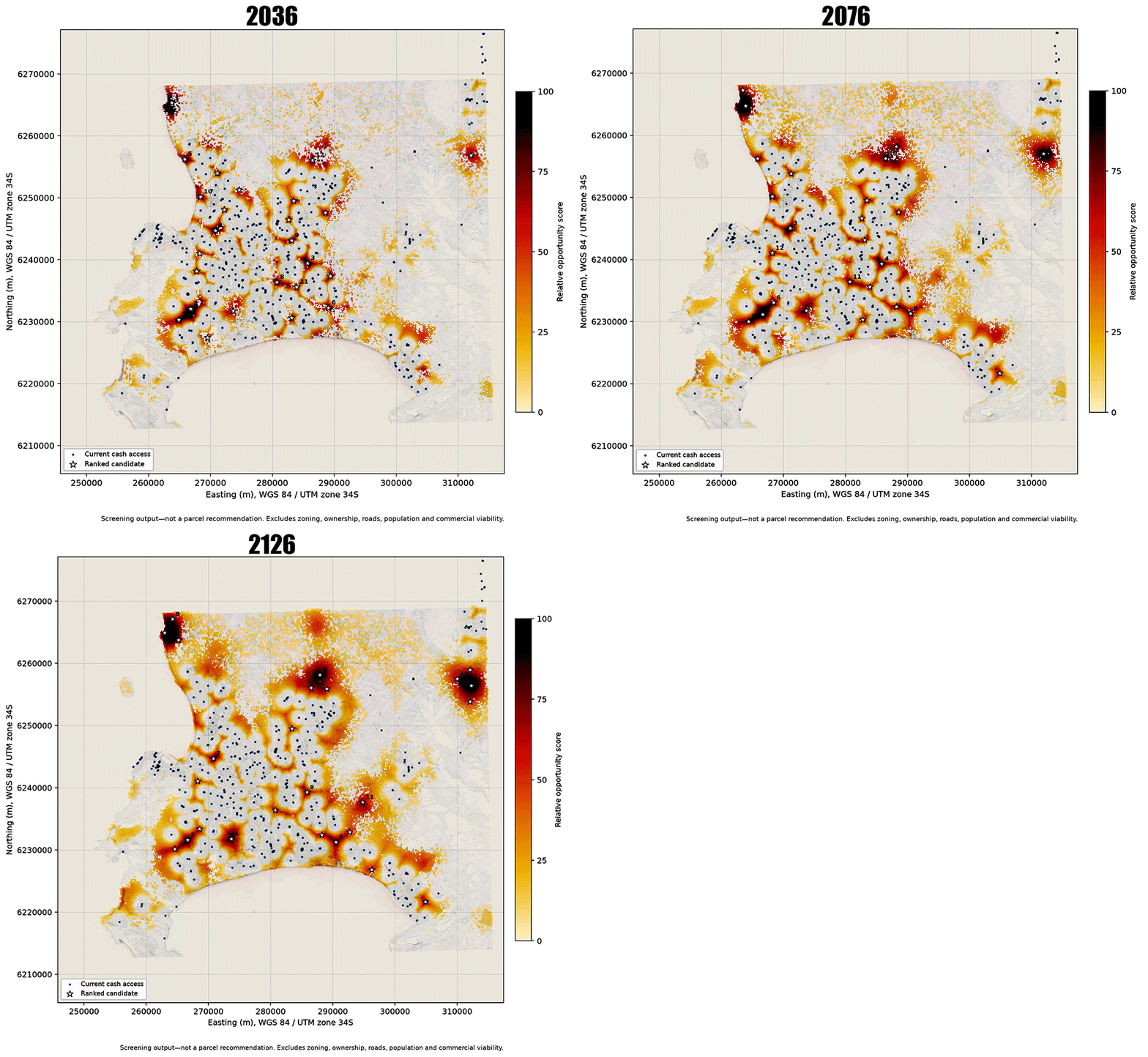
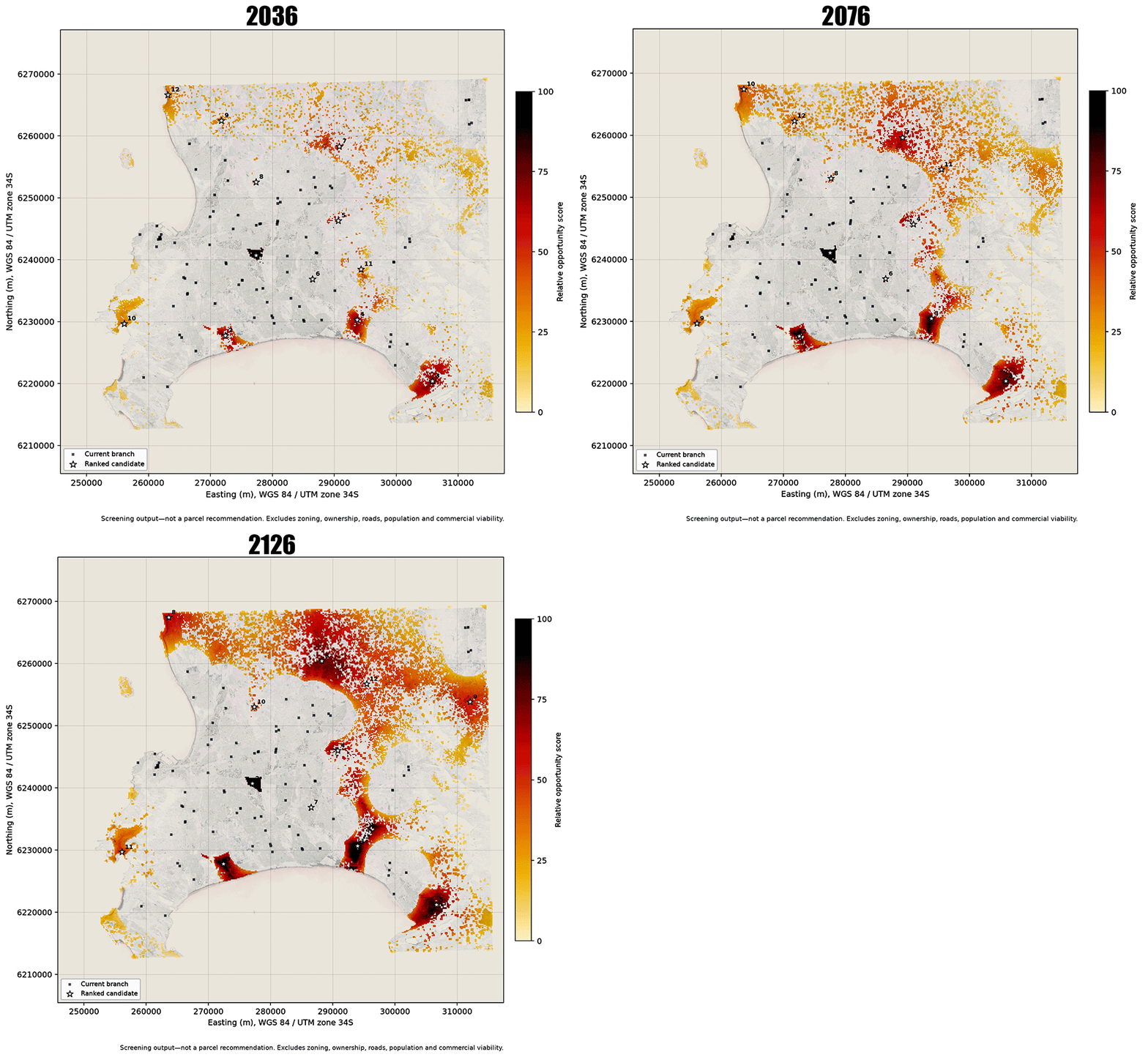
Lastly I decided to show the combined currant and predicted maps overlay on top of each other. With the existing ATMs and branches and then the heat map generated by the above maps and then finally the suggested location of ATMs and branches for all 3 future years.
This is was an really fun and intense project and as with all my projects took ten times longer than what I thought it would take. Are there things I would to differently if I had to do this project over. You bet! I would also take into account the population density and also sub classify the types of buildings into say residential and commercial for example. Perhaps even go as far as to classify each one into sub categories like homes, shopping malls, schools, hospitals etc. I did use roads as part of some calculations, however it did not play a huge part and you would have noticed some images showing building growth just filling in roads as well.
If you wish to have a look at the code you can see most it them in the link below. Keep in mind this does not include the actual data as I did not want to upload 22GB to GitHub.